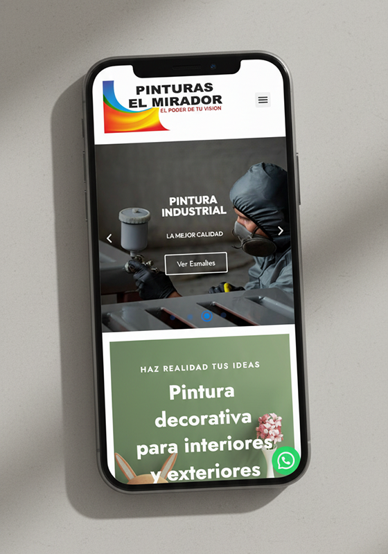
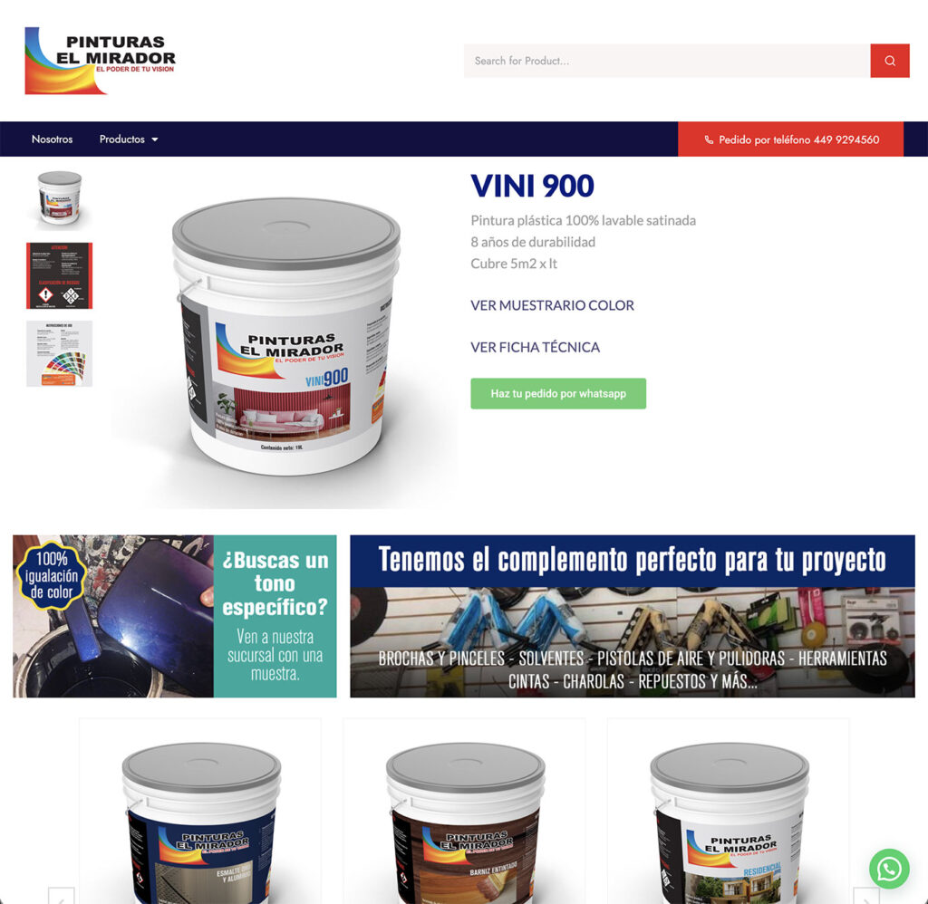
Pinturas El Mirador is a local paint company offering a wide range of products, including automotive paint, wood finishes, home paint, varnishes, and enamels.
The project focused on creating the company’s first official website, providing a clear digital presence and organizing a complex product offering into an easy-to-navigate structure.
Chemical, paints & coating
UI/UX | Web designer
Pinturas El Mirador didn’t have digital presence before this project. The brand operated entirely offline, with only a minimally active Facebook page and no structured way for users to understand its product offering online.
The main challenge was to translate a broad and technical catalog of products into a clear, intuitive website, without overwhelming users or losing clarity. The company offers multiple categories like automotive paint, wood finishes, home paint, varnishes, and enamels, each with different use cases and audiences.
Additionally, there was no existing content structure or reference for how information should be organized. This required defining:
How users would navigate and understand the product categories
What information was essential at a first glance versus secondary
How to build credibility and professionalism for a brand entering the digital space for the first time
The challenge was not only to design a website, but to create a logical system that could communicate the brand’s value, organize its products effectively, and serve as a foundation for future digital growth.
I was responsible for the UX structure and UI design of the website, working closely with the client to translate their product offering into a clear, navigable digital experience.
Since this was the company’s first website, my role went beyond visual design. I focused on understanding the business, its products, and how users would realistically search for information in a paint and materials store.
My approach was centered on:
Defining the information architecture, organizing a wide and diverse catalog (automotive paint, wood finishes, home paint, varnishes, enamels) into clear categories that made sense for both users and the business.
Establishing page hierarchy and content prioritization, ensuring that key information was easy to find and that the website communicated credibility and professionalism from the first interaction.
Designing a clean and functional UI, aligned with the existing brand, while modernizing its digital presence and making it adaptable to different devices.
Balancing client feedback with UX best practices, simplifying complex or ambiguous inputs from the brief into practical, usable solutions within WordPress constraints.
Overall, my role was to transform an offline-focused brand with no digital presence into a structured, user-friendly website that could serve as a foundation for its future online growth.
The visual design respected the existing brand identity while modernizing its digital expression.
Typography, color usage, and layout decisions were made to enhance readability and clarity, reinforcing a professional and trustworthy image without overcomplicating the interface and keeping the essence of the brand.
Instead of organizing the site by technical specifications, the information architecture was designed around how customers think about and use paint products (automotive, wood, home, finishes).
This reduced cognitive load and made the catalog easier to understand for both professional and non-technical users.
As the brand was entering the digital space for the first time, the focus was on communicating clearly rather than showing everything at once.
Only essential information was prioritized on primary pages, with secondary details kept accessible but unobtrusive.
The homepage and category pages were designed to guide users quickly from high-level understanding to specific product categories, ensuring that visitors could grasp the brand’s offering within seconds.
The website structure was intentionally designed to support future growth beyond an informational site. The information and development considered the possibility of evolving into an e-commerce platform.
The structure also anticipates a future scenario where wholesale customers can manage orders, invoices, and account information directly through the website, reducing operational friction and centralizing business processes.
Final homepage design integrating UI, custom graphics, and product visuals into a cohesive system.
Consistent visual language applied across key sections of the website.


Custom labels and mockups for paint buckets designed to visually differentiate product categories and maintain brand consistency.


Promotional graphics designed as part of a scalable visual system (social media example).
All logos, images, trademarks, and campaigns displayed in this portfolio other than the Gabriela Acosta brand are the property of their respective owners. Their inclusion here is solely for the purpose of showcasing professional work and does not imply endorsement, sponsorship, or affiliation.